The Journey of Nothing OS From 1.0 to 2.6
When Carl Pei, one of the key people behind OnePlus, left the company in 2020, many in the tech community wondered: what’s next? He had already helped create a brand that stood out with its “flagship killer” phones, so his new venture, Nothing Technology, carried a certain buzz from day one.
By mid-2022, that excitement took shape with the release of the Nothing Phone (1). Transparent back, glowing Glyph lights, minimalist branding it was clear this wasn’t just another Android brand trying to copy Apple or Samsung. But as striking as the hardware was, a smartphone’s story is never complete without its software layer. Enter Nothing OS.
Table of Contents
What is Nothing OS?
At its simplest, Nothing OS is Nothing’s custom Android skin. That puts it in the same category as:
- Samsung’s One UI,
- Xiaomi’s MIUI (or HyperOS now),
- Oppo’s ColorOS,
- and Google’s Pixel UI.
The difference? While others often overload their software with features, themes, and apps, Nothing OS takes the opposite route: minimalism.
Right out of the box, it feels:
- Light on resources,
- Close to stock Android,
- But not completely plain—thanks to Nothing’s signature design touches.
You’ll notice:
- Dot-matrix font and widgets, which give a retro-futuristic vibe.
- Black-and-white wallpapers, simple but distinctive.
- Glyph interface settings, letting users link LED lights to notifications, calls, and even progress bars.
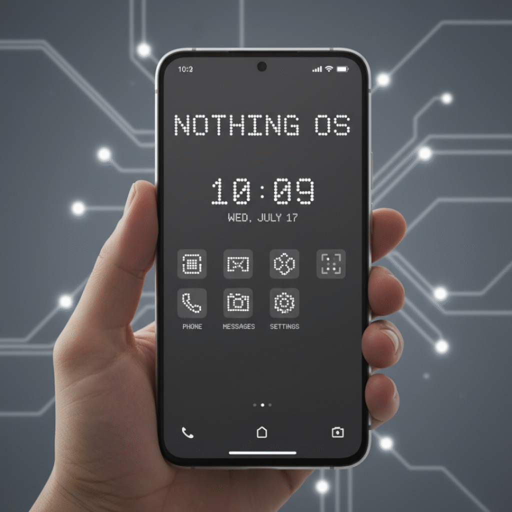
So in short, Nothing OS isn’t about throwing everything at you. It’s about crafting a clean experience that still feels different from every other Android phone.
Nothing OS 1.0 – The Beginning
The first version, Nothing OS 1.0, shipped with the Nothing Phone (1) in July 2022. For a first attempt, it got surprisingly good feedback.
Tech reviewers praised it for:
- Being fast and bloat-free,
- Sticking close to Google’s stock Android design,
- Including exclusive widgets like the dot-matrix clock and weather.
The Glyph integration also stood out. Notifications could trigger custom light patterns on the back of the phone fun, functional, and undeniably eye-catching.
But as clean as OS 1.0 was, it also felt barebones. Compared to Samsung’s One UI or Oppo’s ColorOS, which had years of refinement, Nothing OS was clearly in its early stages. That said, most users preferred a simple, bug-free system over one crammed with features.
Nothing OS 2.0 – Finding Its Identity
By July 2023, Nothing was ready for round two. With the launch of the Nothing Phone (2) came Nothing OS 2.0, and this was the update that showed the brand was serious about software.
The changes were meaningful:
- Interactive widgets: You could now interact with them more deeply, not just view information.
- More home screen customization: Better app grid control and layout tweaks.
- Smarter Glyph integration: The lights on the back weren’t just gimmicks anymore—they connected with apps like Uber (to show your driver’s ETA) and music apps (for playback progress).
- Performance optimizations: Animations and transitions felt smoother, making the overall experience snappier.
In short, OS 2.0 gave Nothing a proper design language. It wasn’t just “stock Android with a funky font” anymore; it was a UI with character, minimal but polished.
Nothing OS 2.5 – The Android 14 Update
In late 2023, Nothing rolled out Nothing OS 2.5, based on Android 14. While it didn’t overhaul the design, it added layers of refinement:
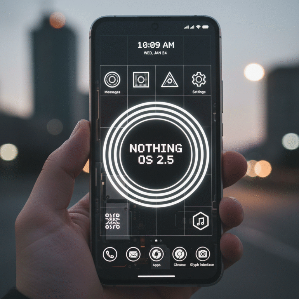
- Redesigned lock screen shortcuts.
- Smoother animations when navigating between apps.
- Extra privacy and system features inherited from Android 14.
This showed that Nothing was committed to keeping pace with Google’s updates, not leaving users behind.
Nothing OS 2.6 – Polishing the Experience
In early 2024, Nothing followed up with Nothing OS 2.6. This was a smaller but important update focused on quality-of-life improvements.
Highlights included:
- Enhanced battery optimization phones lasted longer on a single charge.
- More stable widgets with better functionality.
- Bug fixes and performance tweaks.
While not flashy, OS 2.6 was the kind of update that made daily use more enjoyable. It showed Nothing wasn’t just about the hype but also about reliability.
Nothing OS 3.0 and What Comes Next
By the time Nothing OS 3.0 showed up (with the Phone 2a in 2024), you could tell the company wasn’t just experimenting anymore. Earlier versions felt like the team was testing the waters, but 3.0 gave the impression that, okay, this is starting to look like a real identity for Nothing’s software.
So, what’s new in 3.0?
To be honest, on paper, some of the changes don’t sound like “big” features. But when you use the phone every day, they actually make a difference.
For one, the UI feels smoother animations, scrolling, switching between apps it just doesn’t have that slight clunkiness the earlier builds did. It feels like it caught up to Pixel-level fluidity, which is saying a lot.
And the Glyph lights finally got a bigger role. Not just “oh look, it blinks when a notification comes in.” Now they can act as a timer bar or show charging progress. It’s a small thing, but it makes the gimmick feel useful. Before, it was more of a party trick.
Widgets got a lot better too. You can pull info at a glance music, calendar, weather without opening apps. Nothing’s been pushing that retro widget style since the beginning, but in 3.0 it feels more finished.
And yeah, the battery saver tweaks are worth mentioning. It’s not magic, but idle drain improved, which is nice for people who don’t plug their phone in every few hours.
So, overall 3.0 didn’t reinvent the wheel, but it polished the rough edges that people noticed in 1.5 and 2.0.
What about 4.0?
Now here’s where it gets speculative. Nothing OS 4.0 hasn’t launched yet (as of 2025), but if you look at their update rhythm, it’s fair to expect it late this year or maybe early 2026.
The guesses online? It’ll probably ride on Android 15 and lean into some AI stuff. Adaptive widgets that change based on your routine, notifications that are smarter about what they surface, maybe tighter integration across Nothing devices (buds, phone, maybe even a watch if they ever push one out).
Will they nail it? Hard to say. But Nothing has surprised before, so it’s worth keeping an eye on.
Comparisons with other Android skins
This is where it gets interesting. Everyone who tries a new Android skin ends up comparing it to what they already know.
- Google Pixel UI → Smooth, minimal, probably the closest cousin to Nothing OS. But Nothing adds its dot-matrix design, fonts, and those light tricks. It feels familiar but with personality.
- Samsung One UI → Honestly, it’s a beast. Tons of features, but sometimes it feels like too much. If you like simplicity, Nothing is way lighter.
- Xiaomi MIUI/HyperOS → Customization galore, but also clutter and, depending on region, ads (which people hate). Nothing avoids that mess.
- OnePlus OxygenOS → Used to be clean and fast, but now bloated compared to what it was. Some people literally say Nothing OS feels like “the old OxygenOS” reborn.
So, yeah Nothing’s not trying to outdo Samsung in features. It’s leaning into being light and stylish, and that’s its niche.
The whole design vibe of Nothing Os
One thing you notice if you look up Nothing OS wallpapers they’re everywhere. Minimal, black and white, sometimes abstract. And it’s not just about looking cool; it actually ties into the rest of the UI. The fonts, the monochrome widgets, even the way the Glyph lights sync up it all feels deliberate.
That’s rare in Android land, where half the time the design looks like it was stitched together by different teams. With Nothing, you get the sense that the hardware and software were designed in the same room.
The good and the bad
Let’s not sugarcoat it Nothing OS has its pros and cons.
Good stuff:
- Clean and fast. No random bloat.
- Looks unique. People can tell you’re not on a Samsung or Pixel.
- Updates come regularly, which isn’t a given with every Android brand.
- Works smoothly even on cheaper models like the Phone 2a.
Not-so-good:
- Still not the most customizable Samsung fans will miss all the toggles.
- Bugs sometimes sneak in, especially with big updates.
- Ecosystem is tiny. If you want the Apple-style “everything talks to everything,” Nothing isn’t there yet.
For some people, those are deal breakers. For others, it’s exactly what they want a light, no-fuss Android experience with some flair.
Why it matters
At the end of the day, you might ask, “Why even care about a new Android skin? They all look kind of the same.” But here’s the thing: software is the part you interact with every single day. And most skins either feel too heavy (Samsung), too messy (Xiaomi), or too safe (Google).
Nothing OS is carving out its own identity minimal, a little quirky, and definitely not boring. In a crowded Android market, that’s a big deal.
Final thoughts
From Nothing OS 1.0 in 2022 to 3.0 now, the growth is obvious. It went from “okay, this is clean but kind of barebones” to “alright, this feels like a real competitor.”
It’s not perfect. There are bugs, it doesn’t have a massive ecosystem, and you don’t get every feature under the sun. But you do get a software experience that feels different, in a good way.
And if OS 4.0 really brings smarter AI features and tighter device integration? Then Nothing OS could shift from “cool alternative” to a real reason people buy these phones.
Right now, though, the takeaway is simple: Nothing OS has grown up a lot, and it’s finally standing on its own two feet.